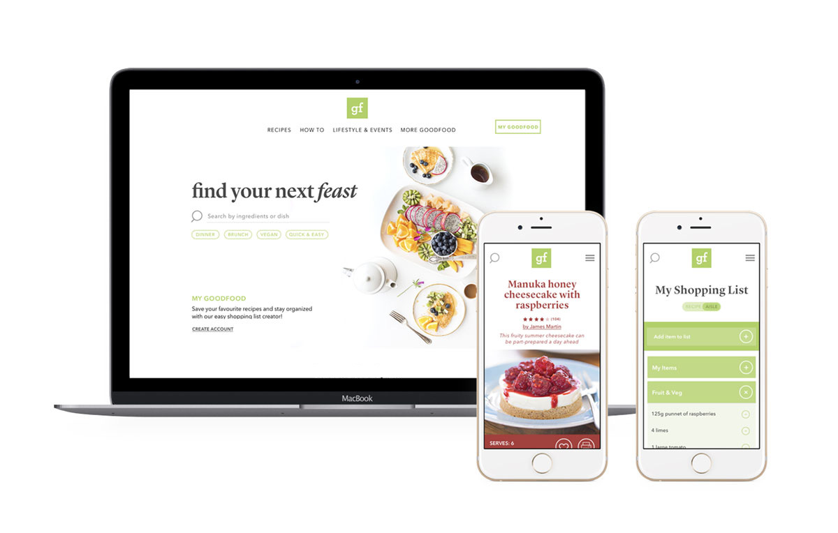
A redesign of the popular UK food and recipe website to modernize and improve the user experience: from reducing the need to scroll and touch a device when cooking to the addition of a new and improved search feature on the homepage to help those 'hangry' people find great recipes, fast!
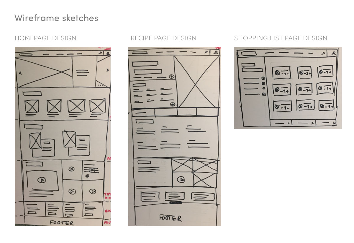
I redesigned 3 pages of the site: the home page, recipe page and the shopping list page for mobile and desktop. Researching current trends for cooking with devices and reviewing the current user profiles of the site, I highlighted pain points in the current user experience and began wireframing to bring a new flow to the selected pages. After sketching, I began creating low fidelity wireframe mockups to help test the layouts and practicality of elements of the design.
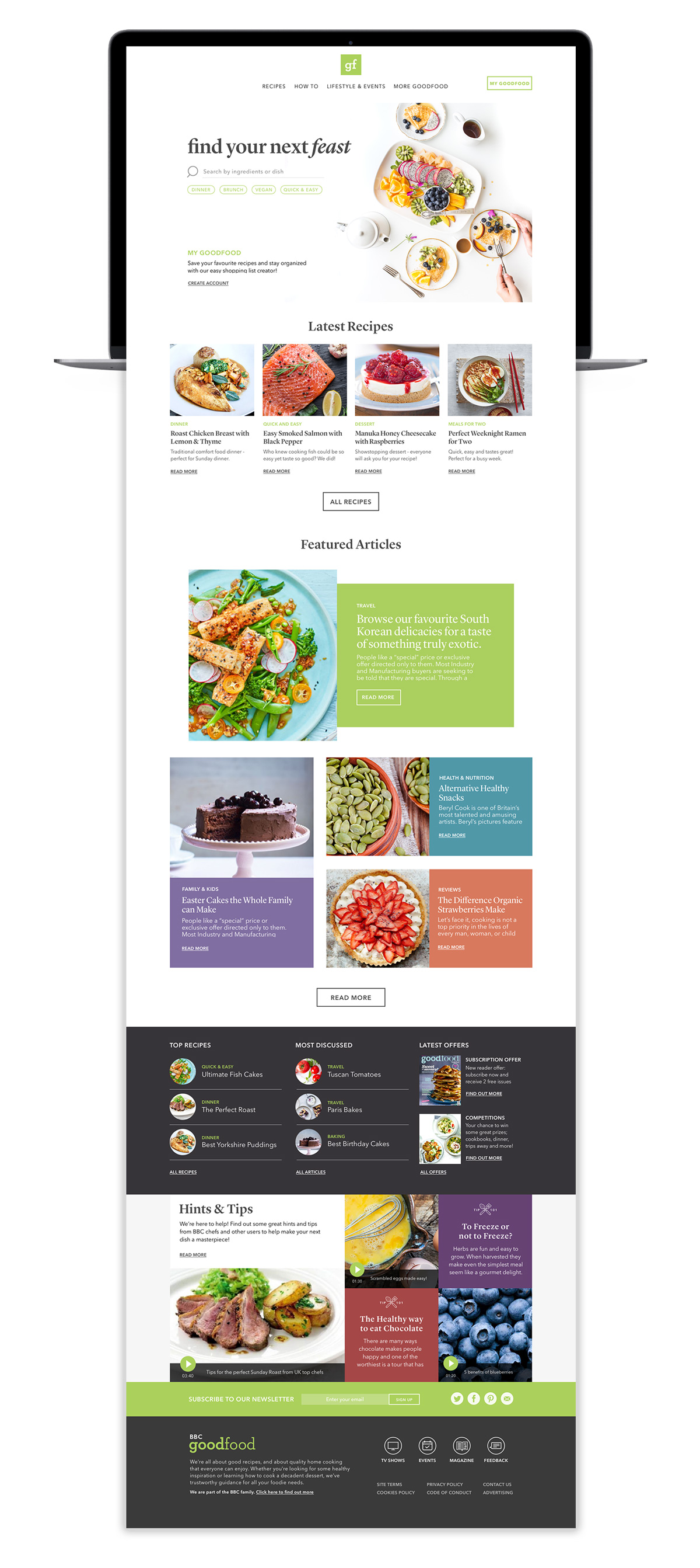
The aim of the redesign was to showcase great food photography and create a modular layout inspired by editorial design.
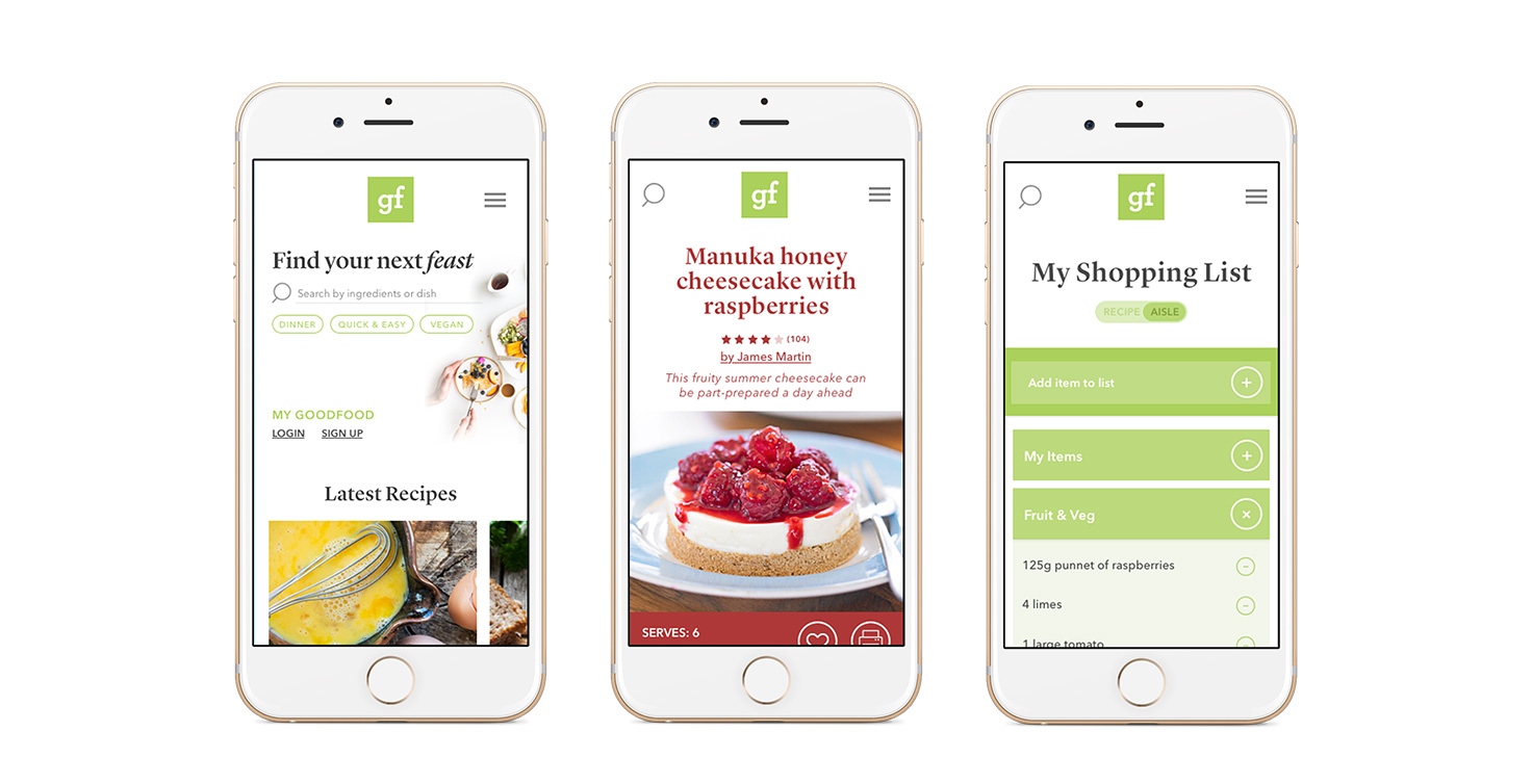
The search function was a pain point and is now a showcase feature on the homepage with options to type or use quick links. On scroll, the search bar transitions to the top left of the fixed header - so this feature will remain visible at all times.
The homepage called for improved organization and hierarchy. It now features distinct sections with clear CTAs thanks to new consistent button styling. The typography has improved hierarchy across headings and body copy, featuring a balance of sans serif and serif fonts together with lowercase and uppercase variants.
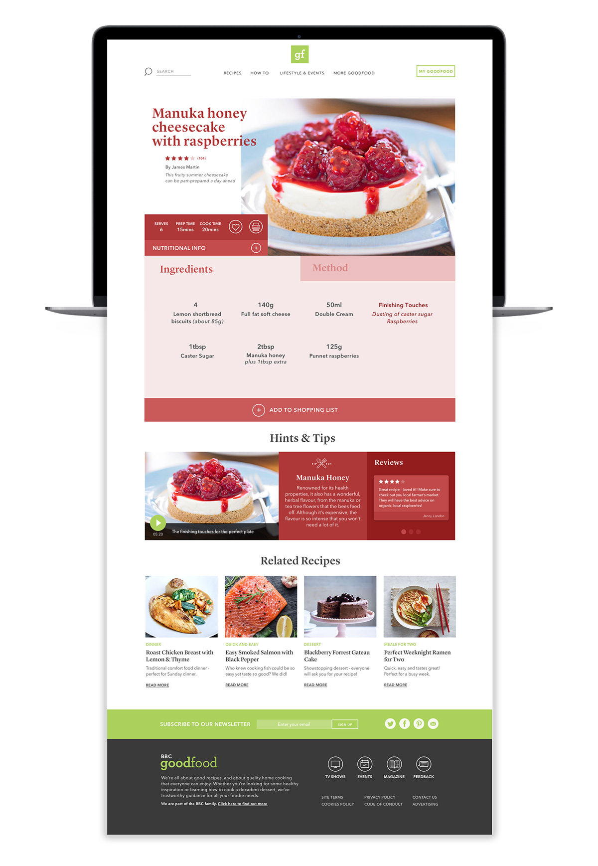
A new modular layout for the recipe page showcases the food photography with editorial styling of the typography.
The aim of the recipe page redesign is to enhance the cooking experience and limit the need to scroll through a recipe. Ingredients and method appear in tab layout so the user can simply tap between the two. A simple 'Add to Shopping List' button collates all ingredients in the newly designed shopping list. Hints and Tips for the recipe are featured underneath: including reviews from other users incorporating a new level of social interaction.
One of the most striking design elements of the recipe page is it's use of colour. Inspired by the great food photography and styling, recipe pages are designed to incorporate the colours and tonal qualities of the main photograph, adding a new depth of flexibility to the design.
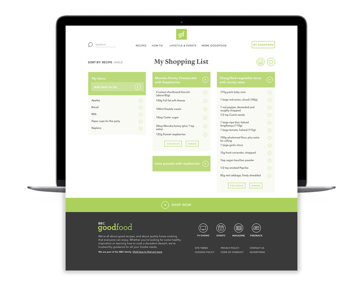
The Shopping List is a useful tool that gathers all ingredients from your favourited recipes. The redesign now presents these ingredients in categories - sorted by recipe or by aisle. Individual ingredients can be added from the panel on the left. Usability is key here; the user can collapse and expand each category and edit any of the quantities or delete items. A clear CTA directs the user to save and send their collated list or bring them straight to their online grocer of choice to finalize sale.
Keeping functionality at the forefront, the design and layout of the desktop screens was adapted for smaller screens by adding interactive menu elements and functions.
I thoroughly enjoyed this project and the design process. I was really interested in exploring the effect an interface can have on the user and their experience whilst cooking - what prevents it from being a hinderance and makes it a helpful hand? It would be very interesting to take this to the next level and see how sound and voice control could further enhance this cooking experience with a home device such as Alexa or Google Home.
If you would like to see any more work from this project or chat about any of my findings, please get in touch!